Skip to product information
1 of 4

Vintage and Antique Gifts

Antique No. 1 Priscilla Broom Label 🧹 Hamburg Broom Works 1920s — NOS Art Nouveau Lithography, Hamburg PA American Made

Regular price 11.00 USD
Regular price Sale price 11.00 USD
Sale Sold out
Shipping calculated at checkout.

Description

# What Was Printed on Every Broom in the Best Hardware Store in Town? 🧹 There is a particular kind of beauty that only exists when something was made to be used up and thrown away — and then wasn't. A label printed to be pasted onto a broom handle, sold off a counter, carried home, and eventually discarded with the broom itself. That was always the plan. The label was never meant to survive. And yet here she is: Priscilla, composed and entirely self-assured, broom raised at a diagonal like a scepter, colors still blazing as though the ink dried last Tuesday rather than a full century ago. There is something almost defiant about the vividness of her. She outlasted the broom. She outlasted the hardware store. She may well outlast us. This is the kind of object that stops you. Not because it announces itself as rare or important, but because it simply *looks* the way good things looked when people made good things without making a fuss about it. --- ## What You're Actually Looking At This is an original **No. 1 Priscilla** commercial lithography label, issued by the **Hamburg Broom Works** of **Hamburg, Pennsylvania**, in the **1920s**. It measures **4 × 4 inches** — a compact, perfectly proportioned square designed to anchor the eye on a product displayed across a wooden counter or stacked in a hardware store bin. The label is **New Old Stock (NOS)**: it was never applied to a broom, never dampened with paste, never pressed against paper or wood. It went into storage sometime in the twenties and stayed there, unmolested, until it found its way into the collector market. The colors are vivid and intact. The stock is clean and uncompromised. The printing process is **commercial chromolithography** — the dominant method for high-quality, full-color commercial printing in America from the 1880s through the 1930s. Each color in the design was laid down in a separate pass through the press, building the image layer by layer on a stone or zinc plate. Done cheaply, it produced flat, muddy results. Done well — as it was done here — it produced the kind of saturated, luminous color that modern digital printing still struggles to replicate. The deep navy of the Art Nouveau border, the blazing red of the central circle, the warm flesh tones of Priscilla's face and hands, the cream and teal of the scrollwork flourishes — these were not accidents. They were the result of a skilled lithographer making deliberate color decisions, pulling proofs, adjusting, and pulling again until the image was exactly right. Someone at Hamburg Broom Works signed off on this. They decided that the No. 1 broom deserved the No. 1 label — and they put a woman of unmistakable presence at the center of it, gave her a name, dressed her with care, and framed her in organic Art Nouveau curves that bracket the whole composition with real elegance. This was not a throwaway label. This was a statement. ---
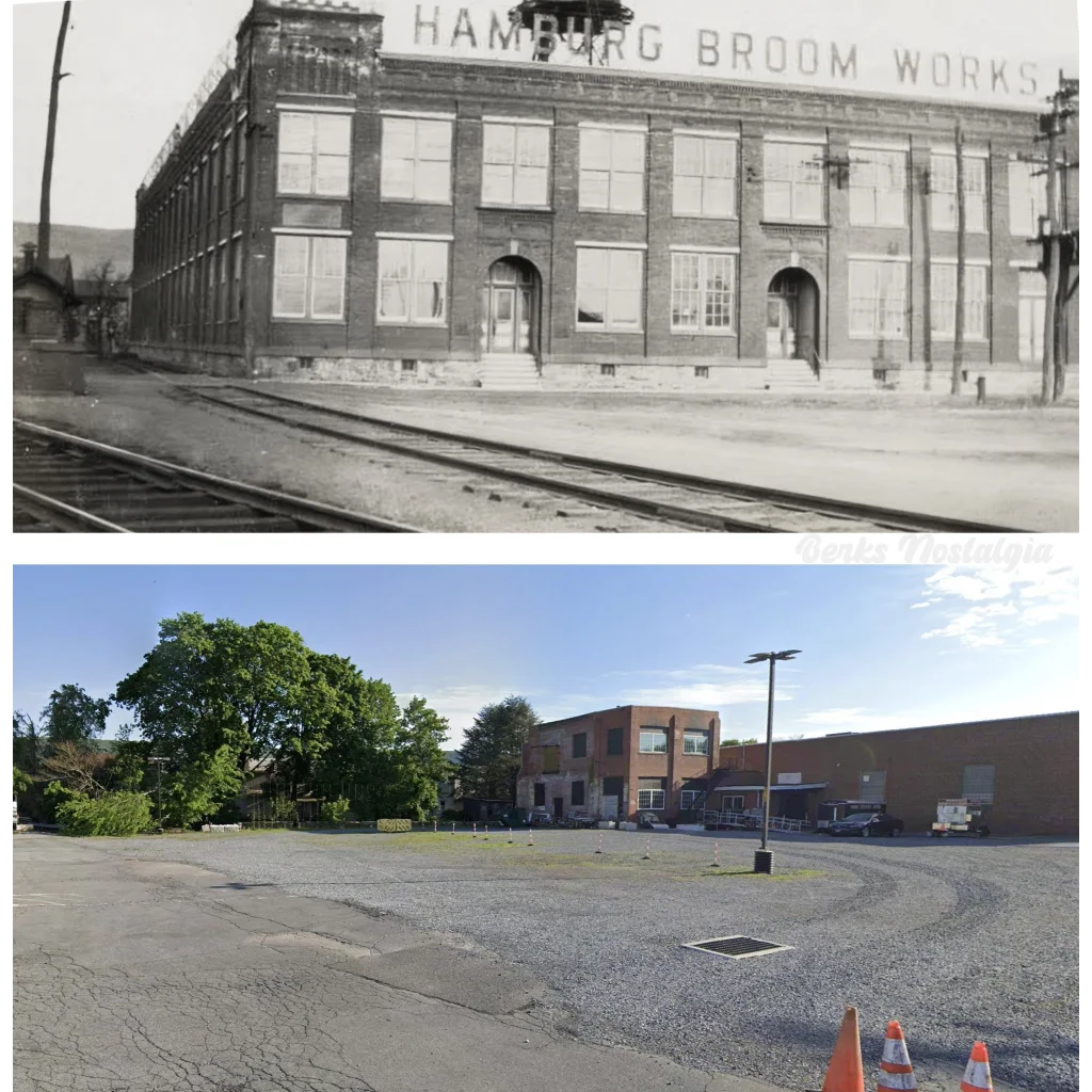
## 🏭 Hamburg Broom Works and the Industry That Built a Town The American broom industry in the late nineteenth and early twentieth centuries was far larger, far more organized, and far more regionally concentrated than most people today realize. **Berks County, Pennsylvania** — and Hamburg in particular — was one of its undisputed centers. The region's proximity to **sorghum-growing farmland**, its access to the **Reading Railroad corridor**, its established labor force, and its tradition of German-American craftsmanship combined to make it one of the most productive broom-manufacturing zones in the eastern United States. Hamburg wasn't just making brooms. Hamburg was *the* broom town. The **Hamburg Broom Works** operated within this tradition, producing commercial-grade brooms for the hardware trade during the peak decades of American domestic manufacturing. Their product line was organized in the classic tiered fashion of the era: different grades, different names, different label designs, with the premium line — the No. 1 — receiving the most investment in presentation. Priscilla was the No. 1. Her label reflects that. The Art Nouveau border alone, with its deep navy ground, sweeping organic scrollwork in teal and cream, and its layered chromolithographic execution, represents a level of print investment that no manufacturer would have authorized for a bottom-shelf product. This was the broom you bought when you bought the best broom. **Local legend has it** that the broom works employed a significant portion of Hamburg's working families during the peak production years of the 1910s and 1920s, and that the smell of dried broomcorn was as much a part of the town's sensory identity as the coal smoke from the railroad yards. Lore passed down among Berks County collectors holds that the Hamburg Broom Works labels were considered a cut above even by contemporaries — that hardware store owners would sometimes keep the better examples rather than apply them, tucking them away in desk drawers because they were simply too handsome to paste onto a handle. Whether or not that accounts for the survival of NOS stock like this one, the story rings true to anyone who has held the label and felt its weight. ---
## 📍 Hamburg, Pennsylvania — A Town Worth Knowing **Hamburg** sits in **Berks County**, tucked against the **Blue Mountain ridgeline** along the old Reading Railroad corridor, roughly sixty miles northwest of Philadelphia. It is one of those Pennsylvania towns that carries its history in its street grid and its building stock — a classic nineteenth-century industrial borough, compact and purposeful, built by people who expected to stay and expected their work to matter. The town's German-American heritage is embedded in everything from its name to its architecture to the kinds of industries it attracted. The Germans who settled Berks County brought with them a tradition of skilled craft and a commitment to quality in manufacture that showed up in iron foundries, textile mills, cigar works, and yes, broom factories. Hamburg was incorporated as a borough in **1837**, and by the time the broom works were operating at full capacity in the early twentieth century, it was a fully realized small industrial city — not a backwater, not a satellite, but a place with its own economy, its own civic identity, and its own pride of workmanship. The **Reading Railroad** connection was essential. The railroad moved raw materials in and finished goods out, connecting Hamburg to Philadelphia markets, to New York, and through the broader freight network to the whole of the eastern seaboard. A broom manufactured in Hamburg in 1922 could be on a hardware store shelf in Baltimore or Boston within days. The railroad made regional manufacturing into national reach, and companies like Hamburg Broom Works were built to exploit exactly that advantage. **Local legend has it** that during the peak years of the broom industry, Hamburg's identity was so thoroughly bound up with broom production that visiting salesmen from competing regions would arrive in town and find the whole commercial culture oriented around the trade — lodging houses, lunch counters, dry goods stores all serving the rhythms of the broom works and the seasonal broomcorn harvest. Lore passed down among Pennsylvania antique dealers holds that the branded labels were sometimes used as calling cards by Hamburg salesmen making their rounds — that a hardware buyer shown a Priscilla label understood immediately what kind of quality he was being offered. Today Hamburg is a **Berks County borough** of about four thousand residents, known to Pennsylvania history enthusiasts, to Appalachian Trail hikers crossing the Blue Mountain, and increasingly to antique hunters and collectors drawn by the region's extraordinary density of documented manufacturing history. Finding a Hamburg Broom Works label in vivid NOS condition is, for a Berks County collector or a Pennsylvania folk art enthusiast, something close to finding a piece of the town's own biography. ---
## 🎨 Priscilla Herself — Reading the Label as Art She deserves her own section, because she is the whole point. The central figure of the No. 1 Priscilla label stands against a **blazing red circle** — a design device that functions almost like a spotlight, isolating her from the surrounding border and giving her a theatrical presence that commands immediate attention. She is dressed in a **black bodice, white apron, ruffled collar and cuffs, and dark stockings**, with a **dramatic upswept hat** completing the silhouette. Her weight is shifted to one hip. One hand rests at her side. The other raises the broom at a diagonal, angled not like a tool but like a **scepter** — an emblem of authority rather than a household implement. Her expression is **composed and entirely self-assured**. She is not servile. She is not performing for the viewer. She is simply present in her own domain, presiding over it, and the broom she holds is an extension of that authority rather than a symbol of subordination. This is a genuinely remarkable piece of commercial characterization for the 1920s — a woman who *owns the room*, as the Hamburg Broom Works clearly understood they were depicting. The **Art Nouveau border** that frames her is executed in **deep navy blue**, worked through with swooping organic scrollwork in **teal and cream**. Art Nouveau as a commercial design vocabulary was already somewhat past its European peak by the 1920s — the style had crested roughly between 1890 and 1910 — but in American commercial lithography, its influence persisted well into the twenties, particularly for premium product labels where elegance and distinctiveness were the goal. The organic curves, the botanical suggestions, the emphasis on flowing line over hard geometry — all of it is present here, handled with genuine skill and restraint. This border does not shout. It *frames*. The total effect is of a label that understood its own market position. This was the No. 1 product, and the No. 1 label communicated that fact through every design decision — the figure's posture, the quality of the printing, the sophistication of the border treatment, and the deliberate choice to give the product a *name* rather than just a grade number. Priscilla is a persona, a brand identity in the modern sense, executed with the full resources of 1920s commercial lithography. ---
## 🖼️ Display Ideas - 🖼️ **Frame it immediately.** A simple black or dark walnut frame — 5×5 or 6×6 interior — lets the deep navy border breathe and turns this into wall art that holds its own in any kitchen, dining room, or study. - 🏡 **Sideboard or shelf display** under a small clip frame or in a vintage brass easel-back frame works beautifully — the square format is naturally stable and centered, and the label's colors carry across a room. - 🍳 **Kitchen gallery wall** with other vintage food, farm, or domestic trade ephemera — seed packets, spice labels, grain sack graphics — where Priscilla becomes the presiding figure she was always meant to be. - 🗂️ **Ephemera collector portfolio display** in an archival sleeve mounted on acid-free backing board, labeled and dated, for the serious paper collector who wants condition preserved alongside presentation. - 🏪 **Vintage shop or antique booth display** as a focal piece on a wall or in a vitrine — the vivid chromolithography reads from distance and draws browsers in the way the best commercial art always does. - 🎁 **Framed gift** for someone who collects Americana, Pennsylvania history, kitchen antiques, or Art Nouveau graphics — already vivid and intact, it needs only a frame to become a finished, meaningful present. ---
## 🎁 Who Collects These The collector audience for a piece like the No. 1 Priscilla label is genuinely broad, and that breadth speaks to how much this single small object contains. **Paper ephemera and advertising collectors** are the natural home base — people who pursue NOS commercial labels, trade cards, broadsheets, and packaging graphics as the primary artifacts of American consumer and industrial culture. For this community, the NOS condition is the whole story: an unaffected, never-applied label in vivid chromolithographic color is the ideal state, and Priscilla delivers exactly that. **Pennsylvania and Berks County history collectors** are a dedicated and knowledgeable group who understand that Hamburg Broom Works labels are primary documents of a specific regional industry. For them, this is not just pretty paper. It is evidence of a manufacturing economy, a labor community, and a commercial culture that shaped the physical and social landscape of Berks County for generations. **Art Nouveau and commercial design enthusiasts** respond to the border treatment and the overall graphic composition. The label is a legitimate example of Art Nouveau influence in American commercial printing, and it holds up aesthetically against far more celebrated examples of the style. **Kitchen antique and domestic Americana collectors** — people who assemble environments rather than archives — find in Priscilla a figure of real character, someone whose presence on a kitchen wall or sideboard adds a layer of personality and historical depth that purely decorative reproductions can never provide. **Women's history and social history researchers** will note the deliberate characterization of Priscilla as a figure of domestic authority rather than domestic service — a design choice that reflects, however commercially motivated, a particular moment in the evolving representation of American women in advertising. And finally, the **first-time ephemera buyer** who simply saw her and knew they had to have her. That person exists, and they are completely right. ---
## ❓ Frequently Asked Questions ### Is this an original 1920s label, or a reproduction? This is an **original 1920s commercial lithography label** produced by the Hamburg Broom Works of Hamburg, Pennsylvania. It is New Old Stock — meaning it was produced during the original manufacturing period, never applied to a product, and has survived in that unused state. The printing, the paper stock, the ink aging, and the overall physical character of the piece are consistent with 1920s commercial chromolithographic production. It is not a reproduction, a reprint, or a facsimile. ### What does "NOS" mean, and why does it matter for condition? **NOS stands for New Old Stock** — a collector's term for original vintage merchandise that was produced and warehoused but never used or sold through to its intended consumer purpose. For a label like this one, NOS status means it was never pasted onto a broom, never exposed to moisture or adhesive, never creased or trimmed for application. The colors have not been obscured by paste residue, the edges have not been trimmed, and the paper has not been stressed by the application process. NOS condition is the highest achievable state for a commercial label, and it is increasingly rare for pieces of this age. ### How vivid are the colors, really? Will they look good framed on a wall? The colors on this label are **vivid and intact** — not faded, not washed, not merely "acceptable for age." The blazing red of the central circle, the deep navy of the Art Nouveau border, the teal and cream of the scrollwork, and the figure's black, white, and warm flesh tones are all present and saturated in the way that well-preserved chromolithography characteristically is when it has been stored away from light and humidity. Framed under glass and displayed away from direct sunlight, this label will hold its color and its visual impact with no further treatment required. ### What size frame should I use? The label measures **4 × 4 inches**. A standard **5×5 inch interior frame** gives it a quarter-inch mat border on each side, which is clean and minimal. A **6×6 interior frame** with a one-inch mat gives the deep navy border more visual breathing room and tends to show the overall composition to better effect. Standard square frame sizes are readily available, and the 4×4 format is one of the easier vintage labels to frame because its symmetry tolerates almost any mat width gracefully. ### Is the Hamburg Broom Works name documented, or is this a hard-to-verify maker? **Hamburg, Pennsylvania has a well-documented broom manufacturing history**, and the Hamburg Broom Works operated within the established industrial context of Berks County's broom and brush trade. The label itself — with its full company name, town identification, and product line designation — is a primary source document. For researchers and collectors working on Pennsylvania industrial history, Berks County manufacturing history, or the American broom trade specifically, this label is a tangible artifact with clear provenance information printed directly on its face. ### Can I handle this label for display purposes, or does it need special care? As with all paper ephemera of this age, **clean, dry hands and minimal direct contact** are the best practices. The label benefits from **archival handling**: hold it by the edges, avoid contact with the printed surface, and if you are not framing it immediately, store it in an archival polyester sleeve away from light, heat, and humidity. If framing, use **UV-protective glass or acrylic** to prevent light-related fading over time, and choose **acid-free matting** to prevent mat burn at the edges. None of this requires special expertise — it is the standard approach for any quality vintage paper piece — and the reward is a display piece that will remain vivid and intact for decades to come. ### Why is this particular label considered special within vintage broom label collecting? Several factors converge here. First, the **NOS condition** — a never-applied label from the 1920s in vivid chromolithographic color is genuinely uncommon. Second, the **design quality** — the Art Nouveau border treatment and the characterization of Priscilla as a figure of authority rather than servitude represent a level of artistic investment that not all commercial broom labels received. Third, the **regional provenance** — Hamburg, Pennsylvania's identity as a center of American broom manufacturing gives this label historical specificity that elevates it above generic trade ephemera. And fourth, Priscilla herself: **she has a name, a personality, and a presence**. Lore passed down among ephemera collectors holds that named character labels — especially those where the character has been given a genuine visual identity rather than a generic pretty-girl illustration — are among the most sought-after in the trade label category. Priscilla is the No. 1 for a reason.

Shipping

🚚 Shipping & Handling

  • Shipping costs and timing are calculated at checkout.
  • Items curated and shipped directly by me include U.S. shipping at no additional cost, professionally packed to ensure safe arrival of your artifact.

Items from Vetted Pro Collectors
Shipping for items offered by vetted Pro Collectors is determined at checkout. All Pro Collector listings are reviewed to ensure fair, reasonable shipping practices.

For full details, please refer to our Shipping Policy.

Returns & Exchange

Product Page Return Policy

  • 60-Day Returns – Items must be in original condition.
  • Refunds – Issued after inspection (excluding shipping costs).
  • Return Shipping – Customer is responsible unless item is damaged or incorrect.
  • Damaged/Incorrect Items – Contact us within 48 hours for a replacement or refund.
  • Easy Returns – Email [email protected] or call 802-356-9872 to initiate a return.

For full details, visit our Refund Policy.

View full details